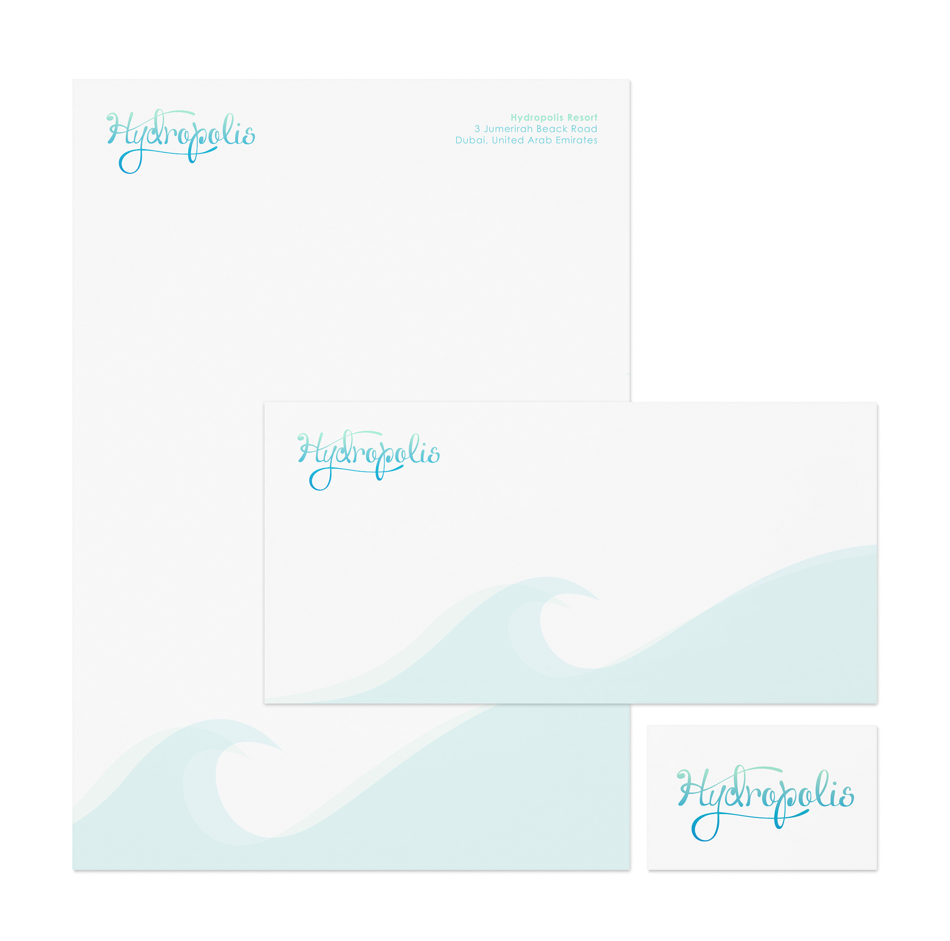
Hydropolis – Logotype
Logo design for the high-end underwater resort– Hydropolis.

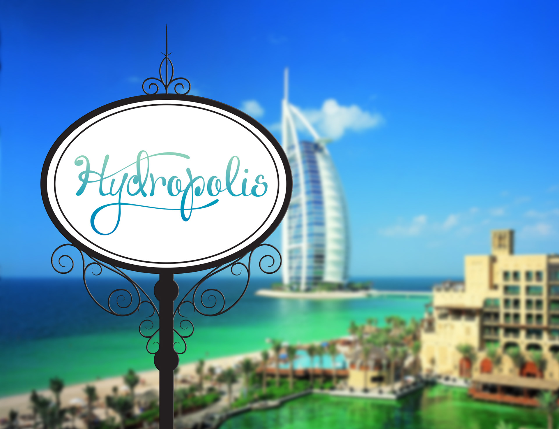
A one of a kind hotel has recently been proposed for construction in Dubai and is in need of a memorable logotype that accuratly represents the hotel’s goal of creating a stronger relationship between visiting guests and the sea.
The project, Hydropolis, will allow guests to stay 20 meters below the surface of the historical Persian Gulf, just off the coast of Jumeriah beach. This undersea hotel will be composed of 220 suites, each costing a hefty $5500 per night. The hotel will also feature a 30,000 square meter building above sea level. The original construction of Hydropolis began in the summer of 2005, but with a lofty price tag of about around $500 million, this construction project has since been suspended due to the economic recession. The architects and designers of this undersea utopia hope to restart construction as soon as the economy recovers.
This innovative hotel needed a logotype that could echo the efirial feel of underwater life. Similar motifs to the swirling designs found in the proposed building’s architecture’s can be seen throughout the bubbly text. A rigid baseline allows for a more playful placement of a ragged x height. This variation and movement mimics the unsteady waves of the ocean. A strong current propels each letter, creating strong thicks and thins. The descender of the y in Hydropolis flows underneath the letter-forms, drawing inspiration from the drifting tentacles of jellyfish and other seemingly magical undersea animals. The crossbar of the H ascends over half of the logo
type and creates a “roof” that echoes the strong movement of the architectural elements of the Hydropolis hotel building. Both of these extending lines (from the y and H) play with the loops of other letter-forms (the d and p respectively) to represent the main goal of Hydropolis – to create a one-of-a-kind, involved experience for guests with the usually unseen world beneath the ocean, and its interesting inhabitants. This hotel was built to work with the ocean and instill a sense of oneness between people and the ocean, combining two frequently colliding worlds and creating harmony. This logotype achieves this sense of harmony, not only through the intertwining letter-forms, swirling strokes, and lively weights, but also through a soft gradient of undersea colors. This palette features a sea foam green/blue, representing ocean water by the surface, and a darker blue, representing the rich blue of the deep sea.
type and creates a “roof” that echoes the strong movement of the architectural elements of the Hydropolis hotel building. Both of these extending lines (from the y and H) play with the loops of other letter-forms (the d and p respectively) to represent the main goal of Hydropolis – to create a one-of-a-kind, involved experience for guests with the usually unseen world beneath the ocean, and its interesting inhabitants. This hotel was built to work with the ocean and instill a sense of oneness between people and the ocean, combining two frequently colliding worlds and creating harmony. This logotype achieves this sense of harmony, not only through the intertwining letter-forms, swirling strokes, and lively weights, but also through a soft gradient of undersea colors. This palette features a sea foam green/blue, representing ocean water by the surface, and a darker blue, representing the rich blue of the deep sea.